5 Tips for Learning Grid

Follow Me on Twitter @Anna J McDougall
When it comes to structuring your webpage using HTML and CSS, the most commonly used instruments are Flexbox and Grid. This week, my course has been covering Grid in a bit more detail, and I've had a chance to hear several points of confusion among those learning it for the first time, so rather than step you through how to implement Grid, I've decided to drop five tips for understanding it better, which will help you wrap your head around this effective and important concept.
For what it's worth, if you do want a step-by-step guide, I can highly recommend A Complete Guide to Grid. I keep this open in a tab every time I'm working with Grid so I have a quick reference to work with, but the first few times you use it you will probably have to go through it section by section. If you're already familiar with Grid and want to get a bit of practice in with the 'span' property, try out this fun CSS Grid game where you use Grid properties to water a garden.
Now that we've covered that and already gotten two resources under your belt, let's have a look at what you need to understand about Grid:
- Grid is used to structure an entire page
- What properties apply to containers, and what properties apply to inner elements
- Grid works in two directions, Flexbox works in one
- You can name Grid areas to make styling easier
- It is common practice to use Flexboxes within Grid
...plus I've added one bonus tip at the end to keep your code readable, beautiful, and useful to everyone who visits your site.
If you can understand these Grid tips, and use them to guide the structure of your pages, you will find structuring your pages far easier and your code will be cleaner and more maintainable in the long-term.
1. Understand that Grid is used to structure an entire page
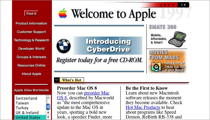
The main use for Grid is the structuring of entire pages. Before the advent of Grid (or Flexbox), the structure of a page would have to be achieved entirely using HTML. This is how coders like me as a little girl learning HTML in the 1990s came to love iframe and table elements, since they represented one of the few ways to give a website structure and form.
Now, you have this amazing tool which can order your elements into a neat structure. Consider yourself very lucky!
Although Grid does allow you to position individual elements, the best way to use it is to structure an entire page. Here is an example of how that can look:
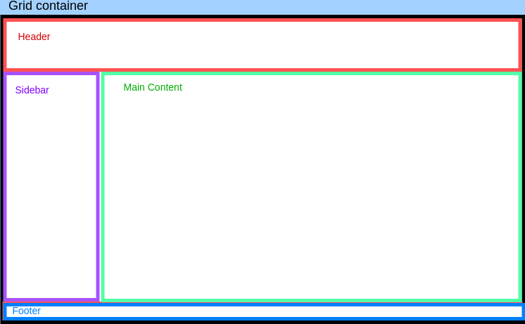
In Grid, this would be a six-cell grid of three rows, and two columns, with the header and footer spanning two columns:
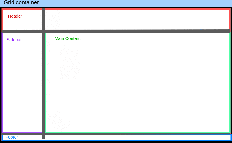
By using Grid, we can secure this structure and know that nothing will shift around on the page.
2. Be clear on what applies to containers, and what applies to inner elements
One of the most common beginner problems when learning Grid is becoming confused as to what properties apply to the grid container vs grid elements. Here are some quick guidelines:
display: gridonly applies to the grid container- Any grid properties which apply to the site as a whole should be placed on the container
- Anything applying only to a specific box (e.g. anything ending in
-self, orgrid-column/grid-row) applies to the individual grid element styling
3. Grid works in two directions, Flexbox works in one
It can be confusing as a newcomer to distinguish between Flexbox and Grid. It's true that with mobile design becoming increasingly prioritised, that flexbox is often used for overall page structure, so why does Grid exist? What is the difference?
Simply put, Flexbox works in one direction (either row or column) and if you want more than one element to fill a Flexbox row, for example, you have to specify the width or flex-basis for each element.
In Grid, structural width and height specifications are done as part of the container styling, rather than on individual elements, giving you one place to see the entire structure of your page. In that sense, it is much simpler to have a clear overview of your page structure. For example:
#container {
   display: grid;
   grid-template-columns: 150px auto 300px;
   grid-template-rows: 50px auto 50px;
}
Here, the column widths have been set: 150px on the left, 300px on the right, and the centre space will fill what's left. Similarly, the rows have been set too: 50px on top, 50px on the bottom, and the centre will fill what remains.
To get this same effect in flexbox, you would either need four containers (e.g. one column container and three individual flexbox rows) or you would need to use flex-wrap in combination with specific block sizing. It can get very messy, and using Grid can save you a lot of time when you're after a structure like this.
Put simply, Grid works in two directions and the basic structuring is done in the container element, whereas Flexbox works in one direction only and any structuring beyond that needs to be implemented on the individual elements.
4. You can name Grid areas to make styling easier
To expand on the point about Grid being easier to 'see structure', there is a great feature of Grid which allows you to name Grid areas so that it becomes easier to 'target' certain Grid areas in your CSS.
Here's an example from the structure we saw above:
#container {
   display: grid;
   grid-template-areas:
      "header header"
      "sidebar main"
      "footer footer"
}
Even without looking at your page, you can already see in your CSS what layout you're using. To 'connect' an element to its corresponding grid area, you can use the grid-area property and simply use the name you gave that section.
For example:
header {
   grid-area: header;
}

footer {
    grid-area: footer;
}
As you can see, this is far easier to read than using row- and column-line indicators or span sets.
5. It is common practice to use Flexboxes within Grid
With all this discussion about the differences between Grid and Flexbox, you might be tempted to think that the two shouldn't mix. This is absolutely not the case! It is common practice to use Flexboxes within a Grid structure.
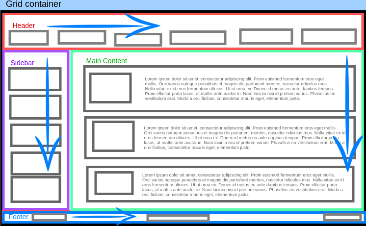
Taking our earlier example, the header and footer could each be Flexbox containers with the flex-direction: row property, while the body and sidebar could be Flexbox containers with the flex-direction: column property. Let's see how that would look, using blue arrows to indicate flex direction within each section of the page:
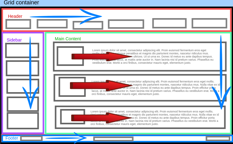
Additionally, our individual main content sections could also use Flexbox with flex-direction: row to position the image and text combination. Here red arrows indicate those Flexboxes:
6. BONUS TIP: You should still use semantic HTML elements with Grid
When looking at Tip 4: You can name Grid areas to make styling easier, you might think this means you can avoid using semantic HTML elements such as <main>, <sidebar>, <nav>, etc. It is still a good idea to use semantic elements, regardless of Grid area names. That's because systems such as screen readers don't actually interrogate Grid styling as structural guidelines for those with impaired visual acuity. That kind of assistance can only be rendered from the actual HTML skeleton of the page.
In addition to that, when looking back at your code (or having others review it), it is far easier to get a 'feel' for what is happening by using semantic HTML elements rather than just gazing confusedly into a sea of <div>s.
So please keep using semantic HTML tags regardless of your Grid structure!
Comments
Join the discussionNo comments yet. Be the first to comment.